I recently wrote about why you need a mobile-friendly website. That leaves the doors wide open to different ways of doing a
There are lots of ways to do mobile, from mobile apps to the mobile web. In the mobile app world, there can be native apps, meaning native to the major mobile operating systems (iOS & Android). In the mobile web world, there can be a mobile web app, a responsive website, or an adaptive website.
All these have strengths and weaknesses, but I think there are some clear winners that can work best for visitors to a website. Winners rather than winner because it really depends on what you’re trying to do.
I’m not going to focus on mobile apps or even mobile web apps because these have such specific uses.
This post focuses on a professional personal brand website which is not professionally managed or created, it’s for creating a presence on the Internet to further your career or get clients.
Doing Mobile Wrong
As with doing most things wrong, it’s easy to do mobile wrong. Mobile may feel easy, and seem like things come mobile friendly today, but that’s not the case. It requires a bit more thought than that. Luckily for you, if you have a mobile device and use it regularly then you probably already understand the pains people on a mobile device have to go through.
The mobile web is the forefront of doing mobile wrong. No longer are we in a day that we can segregate Internet traffic into mobile and not mobile. There is now only one web and that comprises all devices on the Internet.
How do you do mobile wrong with a professional website that’s geared towards roping in potential employers and clients for your career?
Aside from your website not working at all with mobile devices, the next worst thing is to have a mobile wrapper. If you don’t have a mobile compatible website (or even if you do) there are a lot of WordPress plugins that take the meat of your content and wrap it into a special mobile theme.
The problem with this approach?
Your website is extremely simplified, doesn’t look like your website on a computer (how’s somebody supposed to know they’re even visiting the same website?) and a lot of your content is pulled out of your site.
The fact that content is pulled out of your site is enough to make this a horrible approach. Your title and content of a post or page will be the only thing that’s salvaged, outside of that your content is gone. Plugins, social account links, recent Tweets, recent posts, everything is removed and your site is given a basic mobile skin.
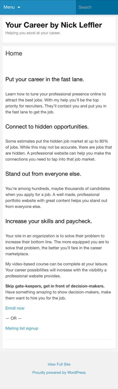
Check your website now. First check if you have a responsive website, you can do that by resizing your web browser on a computer and seeing if the content moves around to fit the screen. If you do have a responsive website then you need to check it out on a mobile device. Open it on yours, does it look completely different from the computer version?
If so you’ve fallen prey to the mobile skin, the largest culprit is probably the WordPress Jetpack plugin. Jetpack used to come with the mobile theme enabled which made it easy to mess up your website, that may have changed but it’s still possible to end up with a theme that modifies your website on mobile. Check your website after installing plugins just in case.
I made a quick video that shows you how to disable the mobile theme from the Jetpack plugin, check it out.
Doing It Responsive or Adaptive
This is where it gets a bit hazier for being mobile friendly. If you’re not sure about what Responsive or Adaptive is, this article does a good job comparing the pros and cons and if you want the simple version, the post I recently wrote covers the basics.
There are good and bad points to each but in the end, a responsive website is going to be the best option. Adaptive websites work well with mobile but they usually lack the consistency between mobile and desktop versions.
Consistency is important for a professional personal brand website and a responsive website is going to give that to you. Not only that but a fluid grid where content resizes fluidly between browser/device sizes is great for the user experience.
No matter where a user views your website, from mobile to desktop it’ll look great. If you pay special attention to links and interactions on your website for mobile users, a responsive website will make it easy for you to cover a visitors experience across all devices.
Try It Out
As you’re putting your website together, I recommend you pull out your smartphone or tablet, whatever you have, and try your website out.
Walk in the shoes of your visitors and try your website out from different perspectives. It’s quick and easy to do so and it’ll make sure your visitors aren’t seeing something that will make them not want to come back.
Doing mobile wrong can make it worse on your visitors than not doing mobile at all. Everything I mentioned about doing mobile wrong and how to fix it can be caught and corrected simply by checking out your website on different devices. A quick look on your smartphone and you’re set.
And when you’re ready to turn your website into a lead generating powerhouse, work with a web designer focused on the purpose of your website.